How to Build a Glassmorphic Header with Astro and Tailwind CSS
I admit, I was quite hyped when I first saw the Liquid Glass designs in iOS 26. After using it for a few days, I’m not sure if I like the excessive use of the effect. I’m curious if it will feel different after I got used to it in a few weeks.
Nevertheless, Glassmorphism (a term first coined by Michal Malewicz in 2021) in its simplest form is an elegant, translucent style that I fell in love with. I saw some websites with Glassmorphic Headers and wanted to add it to my Astro blog with Tailwind CSS.
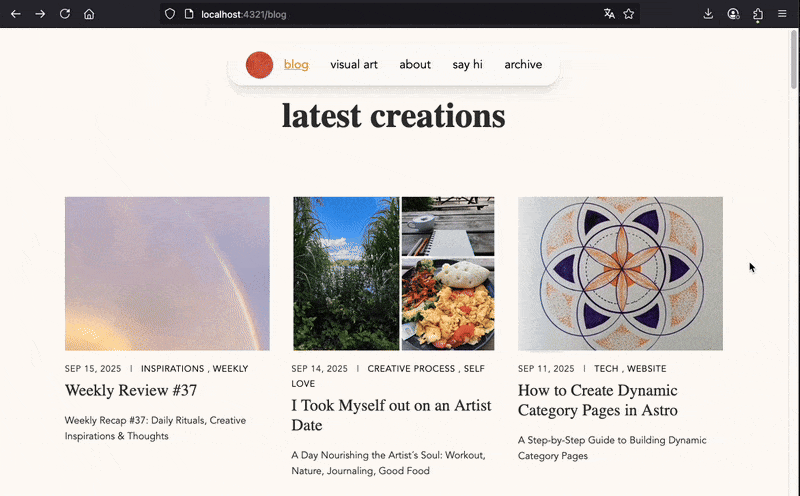
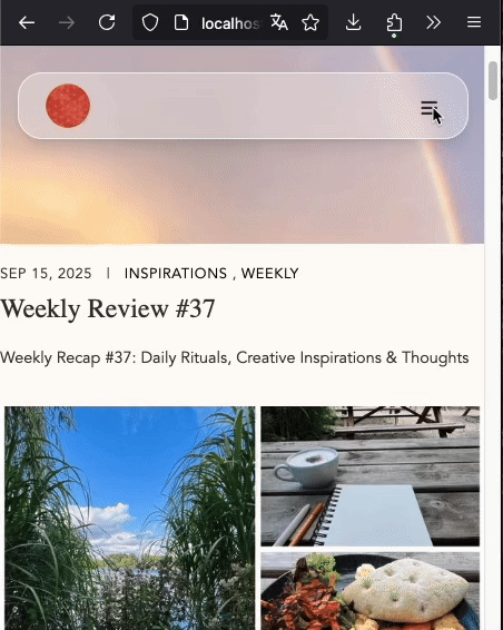
1. Navigation Bar Structure: Logo, Links (and Hamburger Menu for mobile)
The navigation bar has three key elements:
- logo (links to home page)
- links (inline on desktop, stacked on mobile)
- burger menu (only visible on mobile)
<header class="glass-header">
<nav>
<a href="/" class="logo"><img src="/logo.png" alt="logo"></a>
<div class="nav-links">
<a href="/blog">blog</a>
<a href="/visual-art">visual art</a>
<a href="/about">about</a>
<a href="/say-hi">say hi</a>
<a href="/archive">archive</a>
</div>
<button id = "menu-toggle" class="icon md:hidden text-2xl">☰</button>
</nav>
</header>You can add some styling to the header and navigation layout. I wanted mine to be centered with enough space in between the logo and links.
<header id="glass-header"
	class="fixed top-6 left-1/2 -translate-x-1/2 inline-flex items-center justify-center w-[90vw] md:w-fit px-6 h-[60px] whitespace-nowrap rounded-[22px] z-50>
<nav class="flex items-center justify-between gap-4 w-full md:w-auto md:min-w-max whitespace-nowrap"><div id="nav-links" class="hidden md:flex gap-8">whitespace-nowrapkeeps links in one line.md:hiddenhides the burger menu on desktop (mdbreakpoint = 768px)
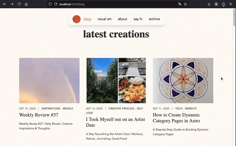
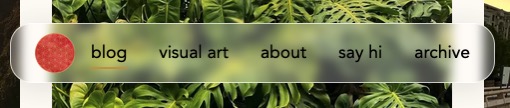
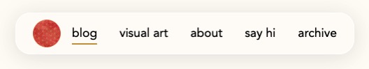
2. Glassmorphism Effect
Glassmorphism uses transparency, blur shadow, and subtle borders to create the ‘glass’ effect. This makes elements feel lightweight, layered, and slightly see-through, giving your UI a modern, polished look.
You can play around with the values here or here.
Using Tailwind CSS add this simple line to your header:
<header class="bg-white/30 border border-white/70 backdrop-blur-md shadow-lg">You can easily change the intensity of transparency, blur and shadow effect.
3. Responsiveness: Mobile Burger Menu
On mobile, links are hidden and replaced by a burger menu. Clicking the icon triggers a dropdown.
<div id="mobileMenu" data-open="false"
class="md:hidden fixed left-1/2 -translate-x-1/2 top-24 w-[90vw] p-4 z-50
bg-white/95 border border-white/70 rounded-[22px] shadow-xl backdrop-blur-md
flex flex-col gap-2
transition-all duration-700 ease-out
pointer-events-none opacity-0 -translate-y-2 scale-[.99]
data-[open=true]:pointer-events-auto data-[open=true]:opacity-100
data-[open=true]:translate-y-0 data-[open=true]:scale-100"
>

<HeaderLink href="/blog">blog</HeaderLink>
<HeaderLink href="/visual-art">visual art</HeaderLink>
<HeaderLink href="/about">about</HeaderLink>
<HeaderLink href="/say-hi">say hi</HeaderLink>
<HeaderLink href="/archive">archive</HeaderLink>
</div>
Remember the button in the header that is only visible on mobile?
<button id = "menu-toggle" class="icon md:hidden text-2xl">☰</button>Using the <script> tag in Astro you can add some Javascript to define the toggling:
const menuToggle = document.getElementById("menu-toggle");
const mobileMenu = document.getElementById("mobile-menu");

menuToggle.addEventListener("click", () => {
  const isOpen = mobileMenu.classList.contains("opacity-100");

  if (isOpen) {
    mobileMenu.classList.remove("opacity-100", "translate-y-0", "visible", "pointer-events-auto");
    mobileMenu.classList.add("opacity-0", "-translate-y-4", "invisible", "pointer-events-none");
  } else {
    mobileMenu.classList.remove("opacity-0", "-translate-y-4", "invisible", "pointer-events-none");
    mobileMenu.classList.add("opacity-100", "translate-y-0", "visible", "pointer-events-auto");
  }
});
4. Scroll Hide Effect (Optional)
For a nice special effect you can make your header disappear whenever you scroll down with a scroll listener.
Header slides up and fades out when scrolling down and reappears when scrolling up. A smooth transition is set with a duration of 1500ms.
<header id="glass-header"
	class= transition-all duration-[1500ms] ease-in-out>
const header = document.getElementById("glass-header");
let lastScroll = 0, ticking = false;
window.addEventListener("scroll", () => {
if (ticking) return;
window.requestAnimationFrame(() => {
const y = window.scrollY;
if (y - lastScroll > 15 && y > 30) {
header?.classList.add("-translate-y-full", "opacity-0");
if (mobileMenu?.dataset.open === "true") {
mobileMenu.dataset.open = "false";
menuToggle?.setAttribute("aria-expanded", "false");
}
} else if (lastScroll - y > 10) {
header?.classList.remove("-translate-y-full", "opacity-0");
}
lastScroll = Math.max(0, y);
ticking = false;
});
ticking = true;
});I hope you enjoyed this tutorial. Have fun recreating it! 🚀